Sunday 22 December 2013

2nd Draft: Digipak


Improvements:
  • I have started to shape the spine and I have made them black.
  • I got rid of the flowers on the CD as I thought it looked messy and didn't work well.
  • Added the Sony Music label on the back cover.
  • I made the left cover inside the same as the right cover inside as I felt the photo was too stretched and having both photos with black rectangle shapes created continuity and the symmetrical aspect worked well.

Saturday 21 December 2013

1st Draft Digipak and Magazine Advert


Ancilary Texts Creating

Magazine Advert and Front Cover
With the use of PhotoShop I took one of my original image where she is laying on a bed and I had an idea for the magazine advert and for the front cover of my digipak. These initial ideas came from doing my recent research on real media texts. The feature I found was the theme of flowers which are very feminine. Therefore I used the Eraser Tool and erased all the area of the room around her.
After erasing everything around her I was left with Shannon laying on a blank background. 


Then with using the Quick Selection Tool it selected Shannon's body which I wanted with pressing CTRL button I dragged her across onto the small flower image. I took this photo at my local florist called 'Florista' then I am planning on Duplicating the small image of flowers and spread individual flowers and leaves to it doesn't look like the same image has been copied several times.

Using the Blur Tool I neatened the edge of her. I thought it didn't look like she was laying on the flowers therefore I thought it was best if the flowers was softly laying on her making her look like she is actually in the flowers. To do this I Elliptical Marquee Tool and circled an individual flower, right clicked and pressed Layer via copy producing just one flower then I Duplicated this layer to as many flowers that I needed and placed them in my desired spot near or on her. 
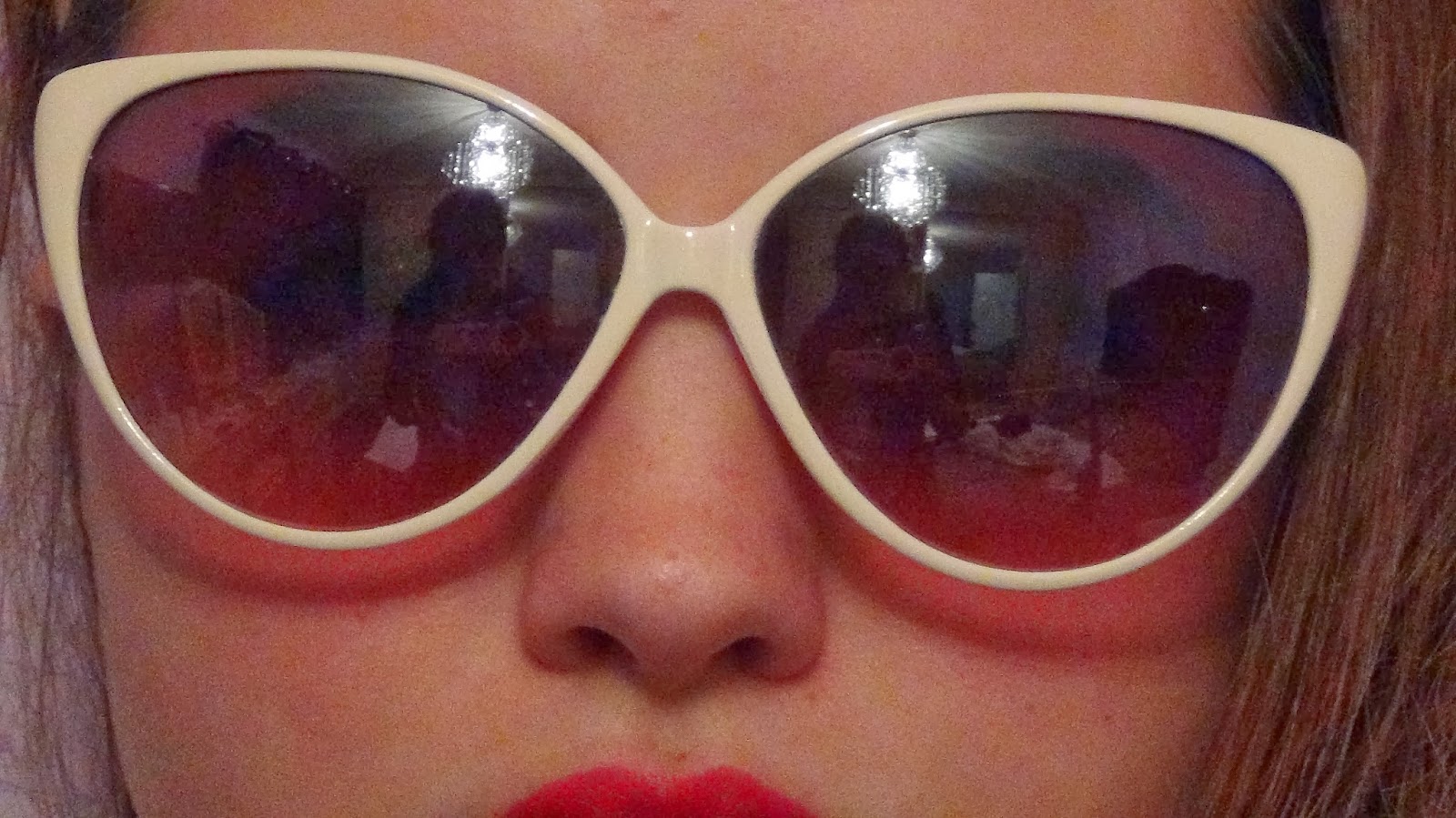
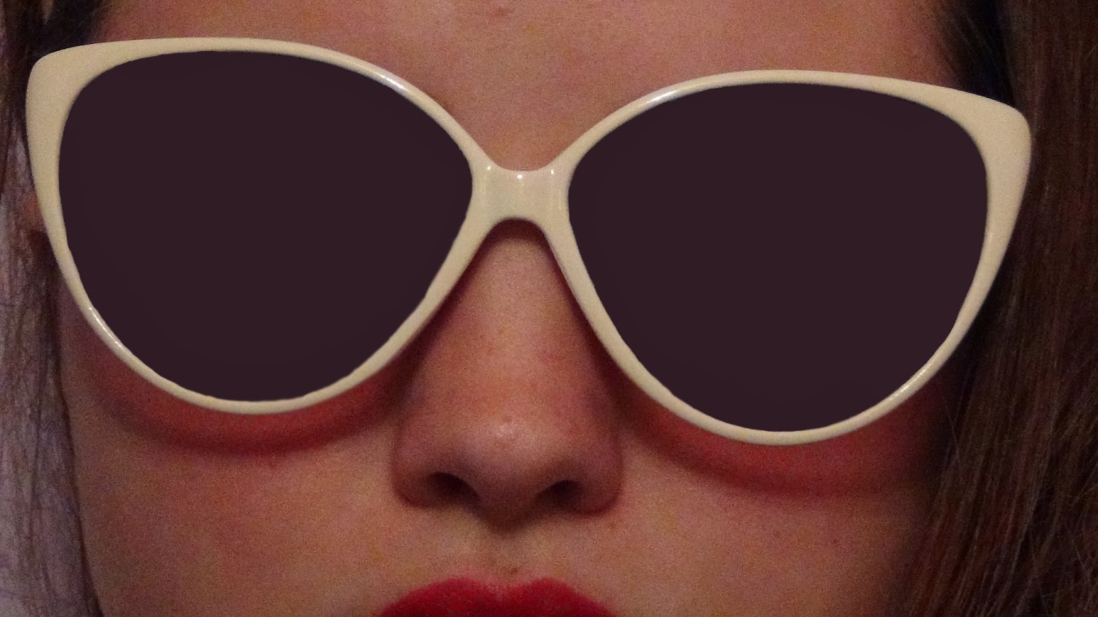


Left Cover
With the use of PhotoShop I took one of my original image of an extreme close-up of Shannon's face for the left cover, A problem which is very clear is this photo is the reflection of me taking this shot.
To over come this problem I used the Eyedropper Tool by clicking on a part of the glasses and this collected the colour. The result of doing this I could then colour the glasses in with this colour by using the Brush Tool and zooming very closely in to the picture helped me get a smooth and clear result. I like the finishing draft as it looks like a block colour fitting into my retro theme.


Cover Inside
 With the use of PhotoShop I took one of my original image for my inside cover. I wanted to include black and white for the basic need of connecting it to my music video therefore I desired to make the background black and white and to keep her in colour.

I successfully did this by Layer-  New Adjustment Layer- Channel Mixer- Output Channel= Grey. Then clicking on black and white the whole picture went black and white, I clicked on the Brush Tool and hovered in on just her and her colour came back, again I had to zoom very close to get a clean finish.

Left Cover (CD)
I used the same process as the inside cover, making the background black and white and keeping her in colour.

Friday 20 December 2013

Artist's Name

Instead of using my actress name 'Shannon Purdy' as it doesn't sound unique nor fancy. Therefore I found out that shannon's middle name was 'Mariah' and thought that 'Mariah Purdy' sounds professional also I felt the name went with her look and her image that I am trying to portray. The result of creating an artist name I then went on www.dafont.com and searched through many fonts to develop my artist name logo. A specific themes that I went on was Retro and Top and these were my top 7 which I liked.


Wednesday 18 December 2013

Codes and Conventions for Digipak

Chosen Digipak


NSPIRATIONAL PRODUCTS
This is the digipak for the solo artist Rihanna. The feminine images of the flowers connote purity and innocence however the colour red of the roses , red hair and lips implies love and lust. The colour red is also an eye catching colour making her attention seeking . This has also achieved continuity with the same colour scheme and images. There is only text of the name of the album and the artists name which are quite small this lets Rihanna's face and images do the talking therefore her image is selling the album. Flowers are seen as natural life and Rihanna laying on them will make her seem more natural towards the audience.


This is the digipak for the solo artist Katy Perry. The images are taken from her music video therefore this sells this specific song and single in more depth. Having these images throughout achieves continuity. It has a child like theme of the sweets and candy having the CD's as a doughnut and a circle lolly however Katy Perry is naked in the cloud of candy floss this adds the sexual desire to the audience and becomes another multiple reality in the post modern media world creating an adult 'fairy tale' as there is no such thing as a cloud of candy which we can happily lay on. The sweets and candy connote positive connotations and joining the main artist in with this makes it fun and appealing. The candy floss is very feminine as we would relate this to a female buying this at a fun fair also with the candy being pink, stereo typically becomes more feminine.   
This is the digipak for the band Marina and the diamonds. Compared to the two examples above this digipak doesn't have the stereotypical feminine colours this will be because they are solo artists and Marina and the diamonds are being represented as a band therefore the colour scheme is more unisex colours this also makes the CD appeal to both genders as the two above may limit themselves to females because of their colour scheme. However out of the band the images only have Marina in and her diamonds are non-existent this implies that she is the main leader and is the main singer in the band also this automatically tells us that she is 'Marina'.  The use of cinematography is effective by having all shots being close-up shots for the basic reason of showing the audience what they want to see which is the artist. The front cover has a sexual approach to the audience as it looks like she is naked but her body isn't shown making her attract males and females.


Before researching some real media texts of CD's I thought it would be best to research the artist of my chosen song as obviously it's my genre and these products will be a great research for me. Therefore below is real products from Lana Del Rey. 


Throughout researching these real media texts I found a feature in the images was the feminine flowers and I think I should try the image of flowers on my digipak. Also this would go nicely with the 1950's image and style of my artist.

Tuesday 17 December 2013

MARXISM - Representation Theory

Karl Marx (1818-1883) Was a German philosopher who believed that material goods are at the root of the social world.

He said that dominant classes create dominant ideology:

How culture is constructed in a way that enables the groups holding the power to have maximum control with the minimum of conflict.

His theory looks at how society is built in ‘classes’ and argues that lower classes cannot better themselves and that upper class people are the powerful and control ideological views put to society.

He states:
  • The power was held by a minority group known as the ‘elite’ or ‘bourgeoisie’ he said that these people have access to capital and because of this they could use their money and power and keep within their group to make more wealth.
  • The majority of the population (us) the ‘mass’ or ‘proletariat’ had their labour to help them make a living.
  • Marx stated because if this industrialisation the elite were the only ones who had access to means of production.
  • Because the elite help the money and the power it meant that the mass were dependent on the elite, the elite took advantage of this power and to maximise their own profits and accountability they need to get as much labour for as little money as possible.
  • Because the workers were dependent on the elite for resources and money the elite group needed the mass old people to accept their role as powerless workers.
  • This basically means the rich are powerful and have lots of money and the rest of us work for the rich to be able to earn a living, we have to accept their role in society. They use us to make money, if we don’t do it we have no role/purpose.

Saturday 14 December 2013

SELECTIVE FILTER MODEL - Audience Theory

Joseph Klapper 1960

Klapper states that the media can only be effective/have impact on an audience once it has undertaken 3 stages.
This theory ensures that the audience has an active role in how they or choose to apprehend or understand the message given and what if any effect on them.

1.       Exposure
The audience has a choice to engage with the media and what types of media they are exposed to. The audience must choose to view, read or listen to the content of specific media. Media messages can have no effect if no one sees or hears them. However that audience chooses depends upon their interests, education, work commitments and so on.

2.       Perception
The audience can then choose whether they wish to accept the message being conveyed. The audience may not accept the message; some people may take notice of some media content but decide to reject or ignore others. For example heavy smokers choose to ignore the television programmes which focus on lung cancer.

3.       Retention
The audience has to then remember the message in order for it to have an effect on them. The messages have to ‘stick’ in the mid of those who have accessed the media content.

Conclusion
ITS ONLY BENEFICIAL IF THE AUDIENCE ARE FIRSTLY EXPOSED TO THE PRODUCT AND IF THEY LIKE THE PRODUCT! 

I can apply this theory to my work:-

Exposure: My audience need to actually choose to see my product therefore they have the first hand choice on putting the music channel on, listening to on radio, download it or search it on an entertainment site like www.YouTube.com where my product would be. This would depend on their lifestyle if they are exposed to these music channels etc what my product would be on.

Perception: My audience may not agree with:
                    - Drinking Alochol
                    - Husband working away and leaving his wife and family
                    - Husband's and wife's role in the household - gender issues in gender equally.

Retention: The message that the audience may take away is what the lifestyle was like in the 1950's, costume, hairstyle, job roles etc therefore can think about the past in more depth. Being alone for a long period of time and missing someone you love, the audience can relate this to themselves, family or friends experiences.

Friday 13 December 2013

HEALTH AND SAFETY

HERE ARE THE HEALTH AND SAFETY ISSUES I WAS FACED WITH WHEN SHOOTING THE VIDEO FROM MY FILMING DAYS UP TO NOW.

MAJOR HAZARD 
1. For shot no.15 my primary actress had to walk into the front door however the primary hazard was she was wearing high stiletto heels not only facing this she had to take one heel off at a time whilst walking
Controlling the measures:
Practicing the shot more than 3 times
- Not rushing and taking it slow
- I and her watching her step 
- Making sure the floor was clear so she doesn't fall and trip on any objects like stones

Possible HIGH chance of injury and this out taken clip is a clear example why health and safety is key!

2. Making sure that the tripod and camera doesn't fall onto me or my primary actress which could cause injury also damage to the camera itself.
Controlling the measures:
- Taking advantage of the counter balance making sure the tripod is steady and not shaky so it doesn't have a chance of falling over
- Filming with the tripod on a smooth surface area so its leveled out to not have the chance of falling over
- Making sure the camera is attached to the tripod with its legs all a the same length

3. Injuries to me or my primary actress resulting from electrical items.
Controlling the measures:
- Make sure no wet hands or bottled drinks etc are near any of the electrical items
- If having the use of dark lighting being very careful around the electrical items
- Making sure not to take the electrical items outside in bad weather conditions

WE ALWAYS HAD ACCESS TO A FIRST AID BOX IN THE HOUSE ALSO MY PARENTS WHO WERE PRESENT ARE FIRST AIDERS!!!


Wednesday 11 December 2013

What have I achieved and what's next?

Now I have successfully done 2 filming days I can now begin to create my first edit on the editing suites before we break off for Christmas. Majority of my first edit will be shots of my cast member as I wanted to get them out the way as I and my cast member was free and had all the mise-en-scene prepared and planned. Therefore after my first edit I can get all the shots including ones with and without my cast member together making it complete. After this I can then start editing for any special effects that I desire to include.

Tuesday 10 December 2013

New Budget List - up to now

Props
Candles-    (Tesco) - £1
Monet Calendar-    (Tesco) - £3
Envelopes-    (Caroles Crafts) - £1.35
Patterned Letter-    (Caroles Crafts)- £1.69
Shirt-    (Dads)- £0
Wine Bottle-    (Already in household)- £0
Watch-     (Mums) - £0
Christmas Tree Star-     (Already in household) - £0

Glue-     (Caroles Crafts) - 80p
15 Sheets Cream Paper -     (Caroles Crafts) - £1.50

Costume
Red Dress-    (New Look) - £8
Heels-    (Primark) - £12
Red Pencil Skirt-    (Shannon's)- £0
Flowered Top-    (Miss Selfridge) – SALE - £10
Cat Shaped Sunglasses-    (River Island) - £8
2 set bow head bands-    (New Look) - £2.99
Checked bow head band-    (Claire’s) - £1
Black Pearl Necklace-    (Primark) - 50p

Hair Equipment
Red Nail Varnish          - Already had £0.
Red Lipstick
VO5 Hairspray -     (Tesco) - £2


Total= £53.83

FILMING DAY 2 - 9/12/13

The second day of filming was 9/12/13. We did the filming in the evening and Shannon my cast member came straight from college. Getting ready and prepared took a little less time compared to 1st day of filming as we knew what to do and knew how to do hairstyles and costume. Starting at 5:00pm - having finish at 7:00pm, we finished then as the shots I prepared to shoot on our 2nd day we got them all done. I believe filming had more of a flow to it this time, as my cast member got into character straight away and she felt more comfortable also I had more of an understanding on how I wanted the narrative to come across to the audience as comparing to the 1st day of filming I wanted to do practice shots and had to concentrate on explaining the personality of the character to my cast member. Again my shots was filmed inside my house new locations in the house compared to the 1st day is the living room,hall way and the stair case.
The same preparation of my cast member was the same but knowing what had to be done it wasn't as time consuming.


VO5 Hairspray - £2
When getting my cast member ready, we learnt from the 1st filming day that my cast members curls was falling out easily therefore we prepared getting hairspray for the 2nd filming day so the curls wouldn't fall out and we wouldn't of had to re-curl her hair. In conclusion the hairspray saved the day as the curls stayed in and we didn't have to waste time re-curling.

I went through with my cast member the lyrics basically highlighting the lyric synchronisation, so my cast member looked like a confident artist in the music video. Also I went through the shots of what I wanted her to perform. Then going through what I wanted her to do on the specific shot again on set.
Overall shooting in, living room, stair case, hall way and bedroom.


Taken Shots : 6,49,50,51,59,60,61,62,63,64,69 
- Re-took shot 10 from 1st day filming.
- Took shot 14 however changed the shot completely.


Additional Costume and Props to FILMING DAY 2.


Friday 6 December 2013

Preparation for FILMING DAY 2

                                                         FINAL POSTCARD

1.  I Found a navy photo and printed it off in colour.
2. I cut it out.
3. Draw round the photo on cream card.
4. Glue the picture onto the cream card.
5. Write my chosen note.


                                                                      Shot no.64
                                                                        Shot no.60
                                                                     Shot no.61
For my last shot no. 64 I looked on  www.google.com on the images and searched ' 1950's Navy Man' and I found a good 1950's navy photo of a man which can be my artist's lover who is working away. I am going to print this photo off and make it into a postcard/letter therefore this will be the letter that will be going through the letter box on shot no.60.